Analysis
Paul L. Delamater
Odum Institute
February 26, 2024
Overview
The following sections provide a few examples of analyses that can be conducted using US Census data.
### Load packages
library(tidycensus)
library(tigris)
library(tmap)
library(tidyverse)
library(sf)
library(magrittr)
library(segregation)

### Load API key
census_api_key("YOUR API KEY GOES HERE")
Population Change Over Time
One of the classic uses of US Census data is to evaluate changes in the number of people residing in a place over time. For geographic units such as counties and states, this is quite easy because the underlying units are (relatively) stable. However, given the extensive changes that occur in the enumeration unit boundaries between decennial censuses, this can be a bit challenging.
The example below shows how to leverage a special function in tidycensus to interpolate values from one set of geographic units to another using high-resolution block population counts. The data are then used to evaluate the percent change in population between the 2010 and 2020 censuses.
### Retrieve population counts by tract for Wake County, NC
wake_dec_2020_pop <- get_decennial(state = "NC",
                                   county = "Wake",
                                   geography = "tract",
                                   variables = "P1_001N",
                                   year = 2020,
                                   sumfile = "pl",
                                   geometry = TRUE) %>% st_make_valid()
                                                    ### ^^ fixes issues in spatial layer
wake_dec_2010_pop <- get_decennial(state = "NC",
                                   county = "Wake",
                                   geography = "tract",
                                   variables = "P001001",
                                   year = 2010,
                                   sumfile = "pl",
                                   geometry = TRUE) %>% st_make_valid()

### Retrieve the block population counts for Wake County, 2020
wake_block_pop <- blocks("NC",
                         "Wake",
                         year = 2020)

### Interpolate
wake_dec_2010_pop_20 <- interpolate_pw(from = wake_dec_2010_pop,
                                       to = wake_dec_2020_pop,
                                       to_id = "GEOID",
                                       weights = wake_block_pop,
                                       weight_column = "POP20",
                                       extensive = TRUE)

## Rename population column in 2020 data
wake_dec_2020_pop %<>% rename(POP20 = value)

## Rename population column in "new" 2010 data
wake_dec_2010_pop_20 %<>% rename(POP10 = value)

## Table join population in 2010 (in 2020 tracts)
wake_dec_2020_pop %<>% left_join(wake_dec_2010_pop_20 %>% st_drop_geometry(),
                                 by = "GEOID")

## Calculate population change (raw and percent)
wake_dec_2020_pop %<>% mutate(POPCH_10_20 = POP20 - POP10,
                              POPCH_10_20pct = 100 * POPCH_10_20 / POP10)
Next, we can create a histogram of change, scatterplot (does there appear to be a relationship between size of tract and change?), and map (where did change occur?) to help us understand the nature of population change in Wake County.
### Histogram
ggplot(data = wake_dec_2020_pop,
       aes(POPCH_10_20pct)) +
  geom_histogram(bins = 20,
                 fill = "lightblue",
                 col = "grey20") +
  labs(x = "Tract-level Population Change 2010 - 2020 (%)")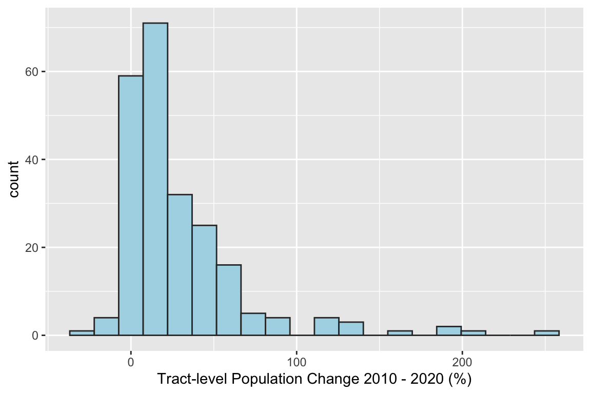
### Scatter
ggplot(data = wake_dec_2020_pop,
       aes(x = POP10,
           y = POPCH_10_20pct)) +
  geom_point() +
  labs(x = "Tract-level Population (2010)",
       y = "Tract-level Population Change 2010 - 2020 (%)")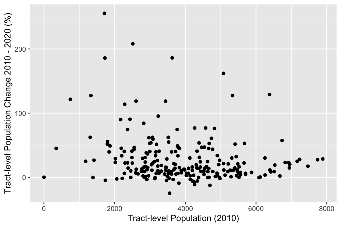
## Make map
tm_shape(wake_dec_2020_pop) +             ## The R object
  tm_polygons("POPCH_10_20pct",                  ## Column with the data
              title = "Tract-level Population\nChange 2010 - 2020 (%)",    ## Legend title
              style = "jenks",               ## IMPORTANT: Classification Scheme!!
              n = 7,                         ## Number of classes or bins
              palette = "BuPu",              ## Color ramp for the polygon fills
              alpha = 0.9,                   ## Transparency for the polygon fills
              border.col = "black",          ## Color for the polygon lines
              border.alpha = 0.3,            ## Transparency for the polygon lines
              legend.hist = TRUE) +          ## Add histogram to show distribution
  tm_scale_bar() +                           ## This adds a scale bar
  tm_layout(title = "Wake County, NC",     ## Title
            legend.outside = TRUE,           ## Location of legend
            frame = FALSE,                   ## Remove frame around data
legend.hist.width = 0.7) ## Widen histogram 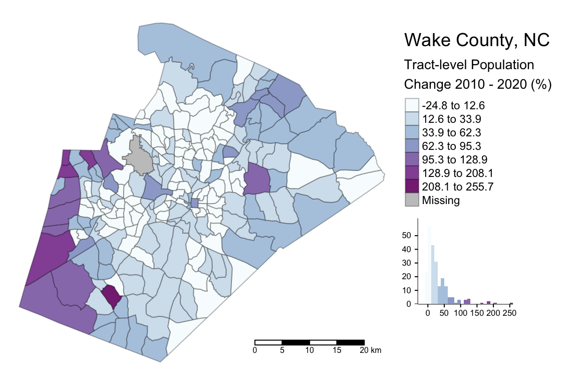
Neighborhood Diversity
Another interesting aspect of regional analysis is the similarity or diversity of people living within a region (e.g., a diverse urban core relative to segregated and homogeneous suburban neighborhoods). In the following example, we measure income diversity by block group in Kent County, MI (home of Grand Rapids). First, the many income categories are collapsed into a more manageable number. The metric used is “entropy” where high values (near 1) represent a perfect distribution of people within income groups in a spatial unit (high diversity) and low values (nearer to 0) represent low diversity within a unit.
### Retrieve data
kent_acs5_2020_inc <- get_acs(state = "MI",
                              county = "Kent",
                              geography = "block group",
                              table = "B19001",
                              year = 2020,
                              survey = "acs5")

## Create new column for combining groups
kent_acs5_2020_inc$inc_group <-
recode(kent_acs5_2020_inc$variable, B19001_002 = "HHI_000_025k",
                                    B19001_003 = "HHI_000_025k",
                                    B19001_004 = "HHI_000_025k",
                                    B19001_005 = "HHI_000_025k",
                                    B19001_006 = "HHI_025_050k",
                                    B19001_007 = "HHI_025_050k",
                                    B19001_008 = "HHI_025_050k",
                                    B19001_009 = "HHI_025_050k",
                                    B19001_010 = "HHI_025_050k",
                                    B19001_011 = "HHI_050_100k",
                                    B19001_012 = "HHI_050_100k",
                                    B19001_013 = "HHI_050_100k",
                                    B19001_014 = "HHI_100_150k",
                                    B19001_015 = "HHI_100_150k",
                                    B19001_016 = "HHI_150k_p",
                                    B19001_017 = "HHI_150k_p")

## Group estimates by new column
kent_acs5_2020_inc %<>% group_by(GEOID, inc_group) %>%
  summarize(estimate = sum(estimate))

## Remove total
kent_acs5_2020_inc %<>% filter(inc_group != "B19001_001")

## Calculate Entropy here!
kent_inc_entropy <- kent_acs5_2020_inc %>%
  group_by(GEOID) %>%
  group_modify(~data.frame(entropy = entropy(data = .x,
                                             group = "inc_group",
                                             weight = "estimate",
                                             base = 5)))


## Attach Entropy to spatial data layer for mapping
kent_inc_entropy_geo <- block_groups("MI",
                                     county = "Kent",
                                     cb = TRUE,
                                     year = 2020) %>%
  inner_join(kent_inc_entropy,
             by = "GEOID")
## Make map
tm_shape(kent_inc_entropy_geo) + ## The R object
tm_polygons("entropy", ## Column with the data
title = "Entropy (Income)", ## Legend title
style = "pretty", ## IMPORTANT: Classification Scheme!!
n = 5, ## Number of classes or bins
palette = "BuGn", ## Color ramp for the polygon fills
alpha = 0.9, ## Transparency for the polygon fills
border.col = "black", ## Color for the polygon lines
border.alpha = 0.3, ## Transparency for the polygon lines
legend.hist = TRUE) + ## Add histogram to show distribution
tm_scale_bar() + ## This adds a scale bar
tm_layout(title = "Kent County, MI", ## Title
legend.outside = TRUE, ## Location of legend
frame = FALSE, ## Remove frame around data
legend.hist.width = 0.8) ## Widen histogram 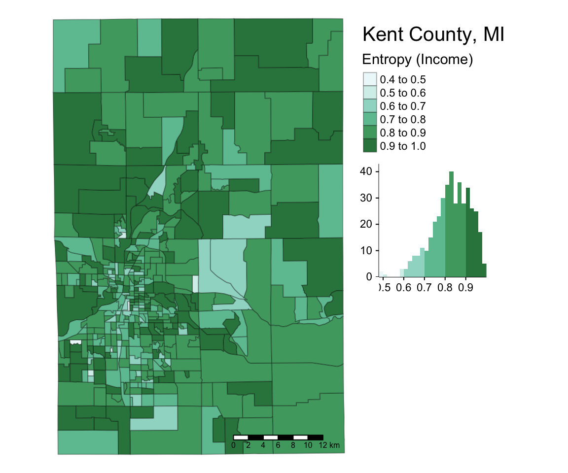
Correlation
When using spatial data, people often ask if there is any special method to determine whether two spatial patterns are similar. They are usually surprised when I say, “Pearson’s R!” This is a simple yet effective metric to determine values for one variable are associate with values from another variable. In R, you can perform a correlation analysis using the spatial object. For example, we can revisit the population change data from earlier.
## Simple Pearson's R
cor.test(x = wake_dec_2020_pop$POP10,
         y = wake_dec_2020_pop$POPCH_10_20pct)
##
## Pearson's product-moment correlation
##
## data: wake_dec_2020_pop$POP10 and wake_dec_2020_pop$POPCH_10_20pct
## t = -3.3982, df = 227, p-value = 0.000801
## alternative hypothesis: true correlation is not equal to 0
## 95 percent confidence interval:
## -0.33996301 -0.09303118
## sample estimates:
## cor
## -0.2200188Challenge
Create an R script to map some variable’s change over time using 5-year ACS data from nonoverlapping time periods (e.g., 2010-2014 and 2015-2019). For example, can you identify places where the proportion of people with a college degree increased? Remember that you will need to interpolate values to new spatial units if you use the 2020 ACS data!
Code
Click here to download the R code from this module
This page was last updated on February 26, 2024