Visualization
Paul L. Delamater
Odum Institute
February 26, 2024
Overview
A great graphic or map can be an important part in the hypothesis generation stage of your analysis or can serve as the centerpiece of the communication component of your analysis. The worn out saying “a picture is worth a thousand words” is worn out because it is so true that people keep saying it. Creating a great visualization is very satisfying… but sometimes the process of getting there can be treacherous. This module walks through some basic visualizations we can create using US Census data.
### Load packages
library(tidycensus)
library(tmap)
library(tidyverse)
library(sf)
library(magrittr)

### Load API key
census_api_key("YOUR API KEY GOES HERE")
Non-map Graphics
In this example, we will be looking at housing and income data from
Durham County, North Carolina. In all the examples, we will be using
ggplot2 to create graphics. There are a lot of useful
resources for working with ggplot, including this, this, and
this
(just to get started)!
### Retrieve Own / Rent data for occupied housing
### Search for B25003 in ACS2020_Table_Shells.xlsx
durham_acs5_2020_own <- get_acs(state = "NC",
                                county = "Durham",
                                geography = "block group",
                                table = "B25003",
                                year = 2020,
                                survey = "acs5",
                                output = "wide",
                                geometry = TRUE)


### Discard the Name and Margin of Error columns
### Select GEOID and cols that end with E
### Do not select NAME
durham_acs5_2020_own %<>% select(GEOID, ends_with("E"), -c(NAME))

### Rename columns
durham_acs5_2020_own %<>% rename(HU_OCC = B25003_001E,
                                 HU_OCC_OWN = B25003_002E,
                                 HU_OCC_RENT = B25003_003E)

### Calculate proportions
durham_acs5_2020_own %<>% mutate(across(c(HU_OCC_OWN:HU_OCC_RENT), ~ . / HU_OCC))

### Retrieve Median Household Income data
durham_acs5_2020_mhi <- get_acs(state = "NC",
                                county = "Durham",
                                geography = "block group",
                                table = "B19013",
                                year = 2020,
                                survey = "acs5",
                                output = "wide",
                                geometry = FALSE)


### Discard the Name and Margin of Error columns
### Select GEOID and cols that end with E
### Do not select NAME
durham_acs5_2020_mhi %<>% select(GEOID, ends_with("E"), -c(NAME))

### Rename columns
durham_acs5_2020_mhi %<>% rename(MHI = B19013_001E)

### Table Join to spatial data layer (with housing data)
durham_acs5_2020_own %<>% left_join(durham_acs5_2020_mhi,
                                    by = "GEOID")
### Preview
glimpse(durham_acs5_2020_own)## Rows: 238
## Columns: 6
## $ GEOID [3m[38;5;246m<chr>[39m[23m "370630018061", "370630001024", "370630016033", "370630021002", "370630020231", "370630010011", "3706300100…
## $ HU_OCC [3m[38;5;246m<dbl>[39m[23m 888, 221, 448, 244, 583, 416, 275, 0, 834, 443, 722, 385, 512, 521, 353, 213, 706, 950, 658, 504, 629, 654,…
## $ HU_OCC_OWN [3m[38;5;246m<dbl>[39m[23m 0.83783784, 0.32126697, 1.00000000, 1.00000000, 0.48542024, 0.35336538, 0.13454545, NaN, 0.03477218, 0.7900…
## $ HU_OCC_RENT [3m[38;5;246m<dbl>[39m[23m 0.16216216, 0.67873303, 0.00000000, 0.00000000, 0.51457976, 0.64663462, 0.86545455, NaN, 0.96522782, 0.2099…
## $ MHI [3m[38;5;246m<dbl>[39m[23m 81548, 62554, 52636, NA, 84669, 46786, NA, NA, 34963, 75729, 19438, 101375, 87266, 41497, 50544, 106750, 74…
## $ geometry [3m[38;5;246m<MULTIPOLYGON [°]>[39m[23m MULTIPOLYGON (((-78.81999 3..., MULTIPOLYGON (((-78.90586 3..., MULTIPOLYGON (((-78.94216 3...…Histogram
Histograms are highly useful to help us understand the nature of the distribution of values for a variable. For example, is there a large range in the proportion of housing units that are occupied by renters (by block group) in Durham County? Is the distribution approximately normal?
### Make simple histogram
ggplot(data = durham_acs5_2020_own,
       aes(HU_OCC_RENT)) +
  geom_histogram()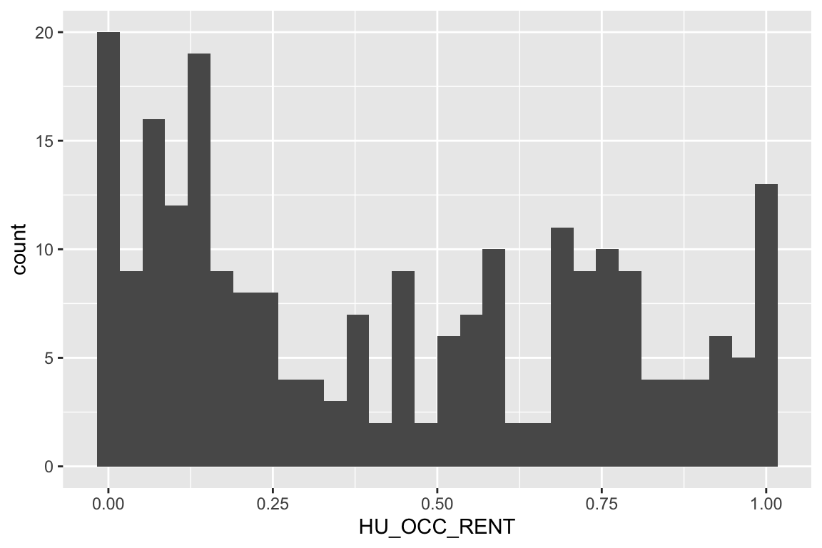
### Make a little nicer looking histogram
ggplot(data = durham_acs5_2020_own,
       aes(HU_OCC_RENT)) +
  geom_histogram(binwidth = 0.05,
                 fill = "lightblue",
                 col = "grey20") +
  labs(x = "Proportion of renters (in occupied units)")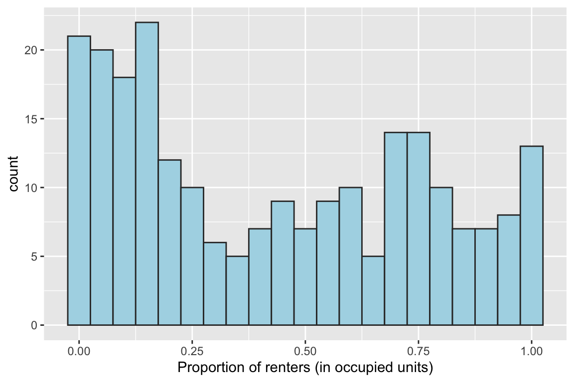
Smoothed Density
Smoothed density plots might be considered more aesthetically pleasing than histograms. Rather than binning the data into discrete classes (as is done in a histogram), a smoothed line representing the distribution (think the “tops” of the histogram bars) is plotted.
### Make density plot
ggplot(data = durham_acs5_2020_own,
       aes(MHI)) +
  geom_density(fill = "blue",
               alpha = 0.5) +
  labs(x = "Median Household Income")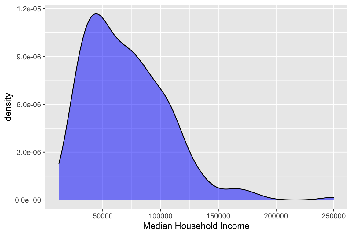
Scatterplot
Scatterplots allow you to visualize the relationship between two numerical variables. They are (or should be) the first step in any correlation or regression analysis.
### Make scatterplot of Income and Renter Occupied
ggplot(data = durham_acs5_2020_own,
       aes(x = MHI,
           y = HU_OCC_OWN)) +
  geom_point() +
  labs(x = "Median Household Income",
       y = "Proportion of owners (in occupied units)")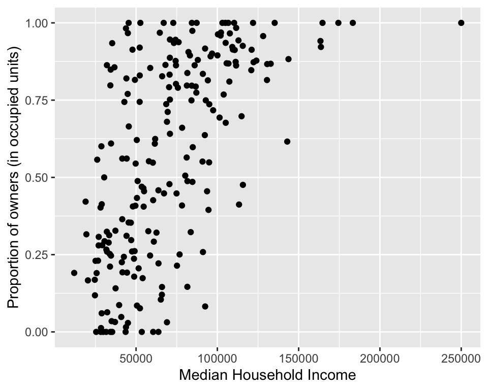
Write Out File
You can use the function ggsave() to write the last
ggplot you created to a file on your hard drive.
### Make scatterplot of Income and Renter Occupied
ggsave("scatterplot.png",
       width = 5,
       units = "in")
Maps
Maps are one of the most powerful visualization tools available to
someone working with US Census data. The data itself lends itself well
to mapping given that it is often aggregated to geographic units. The
following section shows how to create maps in R using
tmap.
Choropleth Map
A choropleth map is a highly common map type for visualizing numeric data for aggregated spatial units. The map uses different shades of color to represent different values. In R, they can be created with a very simple command!
## Make map
tm_shape(durham_acs5_2020_own) +             ## The R object
  tm_polygons("HU_OCC_OWN",                  ## Column with the data for mapping
              border.col = "black")          ## Border color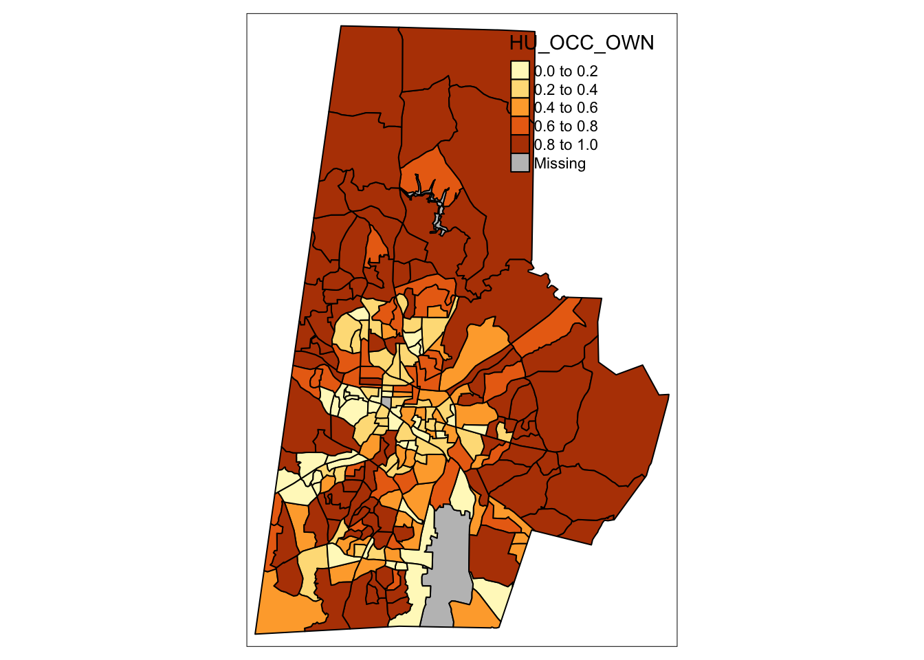
Additionally, they can be highly customized! There is almost no limit to the levers and dials that can be pulled and adjusted to make a nice map.
## Convert proportion to percent
durham_acs5_2020_own %<>% mutate(across(c(HU_OCC_OWN:HU_OCC_RENT), ~ . * 100))

## Make map
tm_shape(durham_acs5_2020_own) +             ## The R object
  tm_polygons("HU_OCC_OWN",                  ## Column with the data
              title = "Owner occupied\nhousing units (%)",    ## Legend title
              style = "jenks",               ## IMPORTANT: Classification Scheme!!
              n = 5,                         ## Number of classes or bins
              palette = "Reds",              ## Color ramp for the polygon fills
              alpha = 0.9,                   ## Transparency for the polygon fills
              border.col = "black",          ## Color for the polygon lines
              border.alpha = 0.3,            ## Transparency for the polygon lines
              legend.hist = TRUE) +          ## Add histogram to show distribution
  tm_scale_bar() +                           ## This adds a scale bar
  tm_layout(title = "Durham County, NC",     ## Title
            legend.outside = TRUE,           ## Location of legend
            frame = FALSE,                   ## Remove frame around data
legend.hist.width = 0.7) ## Widen histogram 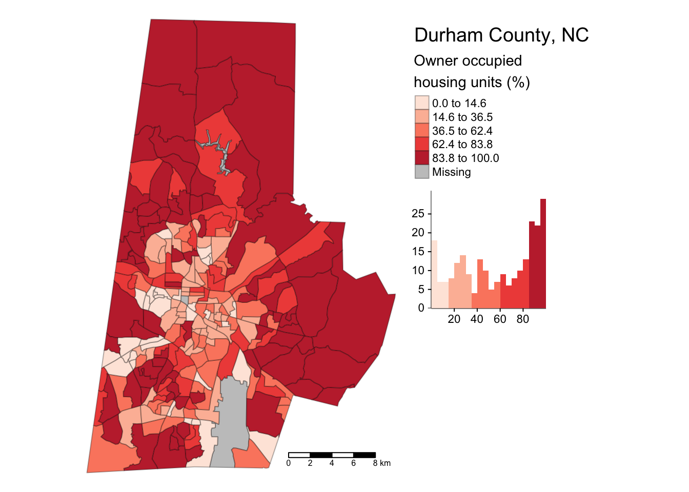
Dot Density Map
From the tidycensus website:
Dot-density maps are a compelling alternative to choropleth maps for cartographic visualization of demographic data as they allow for representation of the internal heterogeneity of geographic units.
Creating a dot density map using the functionality provided by tidycensus requires working with the count data (which we overwrote when calculating proportions). So, we’ll grab some new data to work with for this map! NOTE: the following examples borrows very heavily from the example provided in the tmap reference page for the function!
## Create a vector with variables we will be mapping
race_vars <- c(HISP = "P2_002N",
               WHITE = "P2_005N",
               BLACK = "P2_006N",
               AIAN = "P2_007N",
               ASIAN = "P2_008N")

## Get data from the 2020 US Census
mecklenberg_dec_2020_race <- get_decennial(geography = "tract",
                                           variables = race_vars,
                                           state = "NC",
                                           county = "Mecklenburg",
                                           geometry = TRUE,
                                           year = 2020)

## Convert polygon data to points (for mapping only!)
mecklenberg_dec_2020_race_pts <- as_dot_density(mecklenberg_dec_2020_race,
                                                value = "value",
                                                values_per_dot = 50,
                                                group = "variable")

## Extract one set of polygons from the long data
mecklenberg_dec_2020_polys <- mecklenberg_dec_2020_race %>%
  filter(variable == "HISP")
## Make map
tm_shape(mecklenberg_dec_2020_polys) +
tm_polygons(col = "grey99",
border.col = "black",
border.alpha = 0.25) +
tm_shape(mecklenberg_dec_2020_race_pts) +
tm_dots(col = "variable",
palette = c(AIAN = 'cyan',
ASIAN ='green',
BLACK = 'blue',
HISP ='red',
WHITE = 'orange'),
size = 0.0025,
title = "Ethnicity/Race")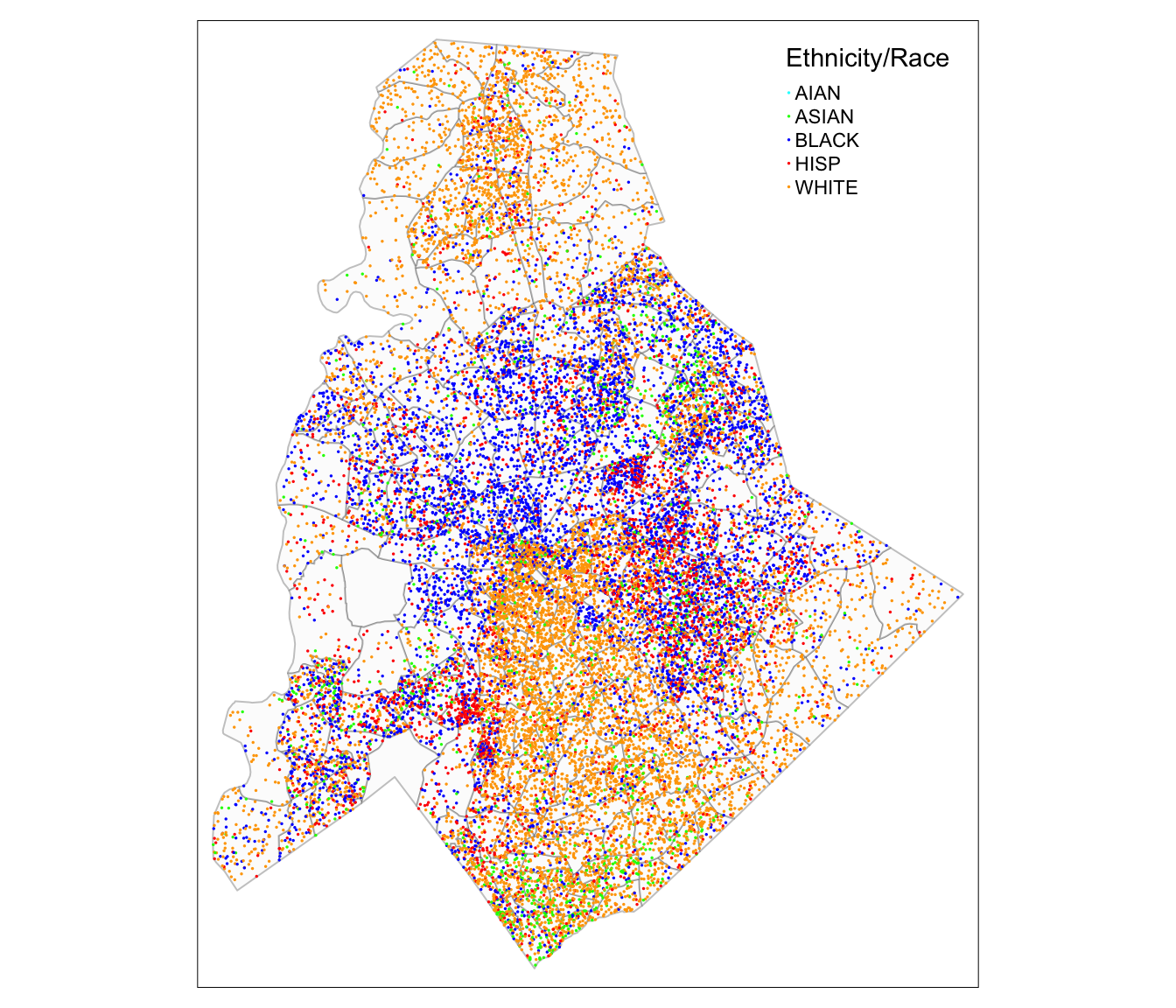
Write Out Map
Maps can be written out by creating a tmap object (note the slight difference in the code in the following chunk) and then saving that object.
## Make map
## Write to object
my_map <-
tm_shape(durham_acs5_2020_own) +             ## The R object
  tm_polygons("HU_OCC_OWN",                  ## Column with the data
              title = "Owner occupied\nhousing units (%)",    ## Legend title
              style = "jenks",               ## IMPORTANT: Classification Scheme!!
              n = 5,                         ## Number of classes or bins
              palette = "Reds",              ## Color ramp for the polygon fills
              alpha = 0.9,                   ## Transparency for the polygon fills
              border.col = "black",          ## Color for the polygon lines
              border.alpha = 0.3,            ## Transparency for the polygon lines
              legend.hist = TRUE) +          ## Add histogram to show distribution
  tm_scale_bar() +                           ## This adds a scale bar
  tm_layout(title = "Durham County, NC",     ## Title
            legend.outside = TRUE,           ## Location of legend
            frame = FALSE,                   ## Remove frame around data
            legend.hist.width = 0.7)         ## Widen histogram

## Write to file
tmap_save(my_map,
        "durham_owner_occ_map.png")
Challenge
Create an R script to create a choropleth map of the percent of people with less than a high school education (B15003) for an urban county or region in your study area by census tract or census block group. Create a dot density map showing the number of people in the following categories (less than high school education, high school graduate or associates degree, bachelor’s degree or above).
Code
Click here to download the R code from this module
This page was last updated on February 26, 2024